
LED Backlight Color Measurements
for the X60, X60s, X60t, X61t, X61s, and X61t in particular
Below are color fidelity measurements of the various X61 screens
fitted with LED strips from several different vendors. I made
these measurements before I began building my own kits and strips,
mainly as a way of quantifying just how dire the color
reproduction problem really was.
I also included a number of strips I made by hand using
general-purpose white lighting LEDs as some early tests (which made it clear
such LEDs were entirely unsuitable), as well as a few other LCD
screens for comparison purposes.
Be aware that most vendors change the LEDs they use almost
constantly, but this should still give some idea as to the kind of
color fidelity roulette one can expect from a random LED conversion
kit.
How to read the charts
CIE colorspace
Short version: The closer the red triangle and + are to the white
triangle and D65 circle, the better.
Longer version: The CIE 1931 color chart on the top left
is a plot of how close the screen/backlight combination comes to
accurate reproduction of basic colors. There are several versions of
the CIE colorspace; I've chosen the oldest and most familiar. They
all impart the same information, they just scale the color areas
differently.
The large, curved, vaguely horseshoe-shaped area represents all the
colors humans can see.
Inside the CIE horseshoe, the highlighted white triangle marked
'sRGB color gamut' indicates the default standard computer monitor
colorspace, that is, all the colors a standard computer monitor should
be able to display. The screens we're measuring here should be judged
against sRGB, so the white triangle represents perfection. Near the
center of the triangle, the circle marked 'D65' indicates the position
of ideal white (a color temperature of 6504K on the daylight locus.
The daylight locus sits slightly above the blackbody locus marked by
the black curve).
The red triangle indicates the actual colors produced by the
display being measured. A red triangle smaller than sRGB means colors
look washed out in comparison. A red triangle larger than sRGB
means colors look oversaturated. Where the triangle corners don't
line up, that color is shifted in hue. For example, it's common for
low-power displays of this era to shift deep blue toward cyan in order
to increase apparent brightness.
The red '+' indicates the actual measured white color produced by the
display. The closer the plus is to the center of the D65 circle, the
closer the display's whitepoint is to correct.
Color bars
Short version: Given the color on the left side, the
display actually shows the color on the right side. The closer the
colors on the left and right match, the better.
Longer version: The color bars illustrate the relative
color differences between an ideal sRGB display (the reference color
on the left), and the same color as it would be displayed on the
measured monitor (the displayed color on the right). Of course, very
few displays perfectly match sRGB, so even the absolute reference
colors are going to be displayed differently on different
monitors. However, the relative color difference will still
be approximately correct so long as the display in use is anywhere
close to sRGBish behavior.
Each color bar also contains a few numerical measurements. The
white bar shows the correlated color temperature, brightness of the
display in nits, and the CIEDE2000 perceptual error between the
measured whitepoint and the closest point on the daylight locus. The
black bar shows the measured blackpoint brightness and contrast ratio
of the display. The color bars each show the relative measured
saturation (actually 'perceived colorfulness', but close enough) of
red, green and blue as compared to the reference in the CIELCH
colorspace, as well as the CIEDE2000 perceptual error between the
reference and measured primaries taking the measured whitepoint into
account. Ideal saturation is 100%, and ideal CIEDE2000 error is 0.0
(less than ~3 is usually considered imperceptible).
Raw spectral power density
Short version: Don't worry about it.
Longer version: The SPD (spectral power density) is the
raw power-per-spectral bin data collected by the spectrometer. The
software makes separate readings for red, green, blue, white and
black. This information is then used to compute the various color
metrics.
The SPD plot shows this data in raw form, normalized so the highest
peak always fits on the graph. In this form, the data doesn't say
much [directly] about final color rendering, but the curves can tell us
both about the backlight technology in use (CCFL, white LED and RGB
LED backlights will all look significantly different on such a graph)
as well as the color filters used in the LCD panel.
Measurement details
These measurements were all taken using a UPRTek MK350N handheld
spectrometer that returns absolute mW/m²/nm spectral irradiance data
in 1nm bins from 360nm to 760nm. This device is designed for
relatively high-intensity measurements and features a wide-angle
cosine-corrected sensor meant for ambient lighting use. Monitor
measurement, on the other hand, requires low light sensitivity and a
narrow field of view (not to mention conversion to nits).
I designed a measurement harness for the spectrometer with
narrow-field correction optics and a large aperture to give it a
roughly 10 degree field of view and boost light gathering by about a
factor of 15x. The optics plus long exposures and noise profiling
software gives the device a minimum useful sensitivity/accuracy of
about .005nits. Reproduceability was well within than the natural
brightness variability of the backlight hardware.
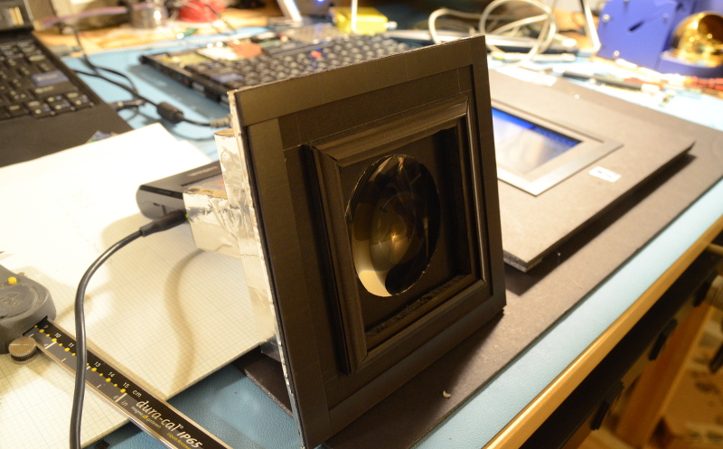
Above: These measurements were made by fitting custom optics to
an MK350N spectrometer (using only the highest-precision laboratory
grade foamcore and hot glue), then fitting the spectrometer and
optics to a mounting baffle that enveloped the LCD panel.
Because of the very narrow field of view, the measurement figures
are a bit different compared to consumer grade monitor calibration
hardware. Contrast and brightness numbers especially may be somewhat
higher than you'd measure with, e.g., a Spyder colorimeter. The narrow
field of view is blind to off-angle glow and bleed and measures the
emitted light in its strongest direction, so it gives near-optimal
'dead on center, straight-ahead' scores.
Notes and observations
We can draw several conclusions from these measurements.
None of these panels are high-saturation under the best of
conditions.
Even high quality general-purpose lighting LEDs (e.g., the Osram,
Cree, Luxeon, Toshiba, and Hebei LEDs above) have inappropriate
spectral output for backlights. 6500K LEDs do not result in a 6500K
panel whitepoint. The LCD panels themselves filter the light
nonuniformly, and the spectrally yellow-green heavy output of high
efficiency lighting LEDs is selectively overemphasized.
LED backlight replacements using white LEDs based on a blue pump +
yellow phosphor (ie, nearly every white LED produced today) shift the
saturation balance significantly. The overall impression can still be
acceptable, though with a noticable loss of saturation and a shift of
reds and greens toward yellow.
Specialty LEDs designed for backlight use (eg, LEDs that use blue
to pump separate red and green phosphors with little yellow overlap)
can avoid this problem. They can, in fact, improve saturation and
color rendering over the original CCFL.
Badly matched LEDs can skew the color output pretty hard. And,
unfortunately, the highest-efficiency LEDs tend to have the worst
color (as they lean harder on the yellow/green portion of the spectrum
for higher apparent output).
Whatever the LED used, they're between somewhat and substantially
brighter than a CCFL.
Lastly, different screens looked best with different LEDs. The
AFFS screens especially require LEDs with lower-than-usual green
output, and as little as possible yellow. Most of the LED conversion
kits being sold on the web appear to be more appropriate for TN
screens. Few look good when used with AFFS.
[Index]
—Monty
(monty@xiph.org)
May 22, 2015
